

Canopy is the shared design system I created to unify LocalHop and Kalpa, two separate products built by Cynerge. The system introduced design tokens, accessibility standards, and reusable components to replace the inconsistent, ad hoc UI we started with. Canopy helped us scale faster, clean up visual debt, and improve handoff between design and dev teams.
Goals
View in Figma
Role
Product Designer
Timeline
2023-2025
Devices
Web / Mobile
Scope
46+ components, responsive variants, variable tokens, accessibility baked in
Thanks to
Brittany Buckley for her design feedback and guidance on Kalpa. Steve Moore, Shawn Chapiewski, and Brian Davidson for their dev insight and support throughout. And Devon Taylor for backing the system and helping shape its direction from a business perspective.
Foundations
Canopy's foundations create a shared design language for all products, keeping things consistent and easy to use. We focus on color, typography, and size, making sure everything is simple for both designers and developers. This way, handoffs are quick, updates are easy, and the system is ready for the future.
Color
Each color variable is named by purpose; not appearance, so developers and designers can use them without second-guessing context. For example, Action / Outline / Normal or Interaction / Focus / Default tell you exactly how and where they should be used. This makes updates, theming, and debugging faster while keeping the UI more consistent and resilient.


Variables applied to components
Semantic Aliasing
To keep the system scalable and context-aware, I introduced semantic aliasing. Colors are named by purpose, not appearance. Instead of using raw color names, I mapped global color tokens to roles.

Here’s how a global token evolves across levels
This made it easier to apply colors consistently across products, support future theming, and keep design and code aligned without any second-guessing.


Global color variables & semantic partners
Typography
I built a fluid, responsive type scale, ensuring clarity across screen sizes and resolutions. Each type style like headings, body, captions, was defined with consistent line heights, letter spacing, and cap heights to eliminate misuse.

Typography aliasing example
Dimensions
The dimension system brought consistency across layouts and components for things like spacing, padding, border radius, and general sizing. It simplified alignment, reduced guesswork, and kept everything from form fields to cards visually balanced and responsive. Developers could rely on it to avoid one-off overrides and streamline implementation.


Components
Instead of showing every component I built, I’d rather show how they’re built with a couple examples. Each component was designed to be flexible, scalable, and easy to implement. They’re driven by variants, powered by variables, and structured with developers in mind.
Button
A versatile and interactive element. Buttons allow users to perform actions and navigate through an application. They come in various styles and sizes, providing clear visual cues and feedback to users.
Behavior & Structure
The button component adapts through variants and booleans for type, intent, size, and state. Optional icons and editable text make it flexible, from icon-only actions to full width CTAs, all in one component.

System Variables & Sizing
Padding, height, icon spacing, and radius are all controlled by system variables used across every component. This ensures consistent and responsive sizing that’s easy to update for any theme or screen size with no manual overrides needed 🎉

Card
Displays content and actions in a visually organized manner. Cards are typically used to present grouped information, like forms, or user profiles, within a grid or list.


Behavior & Structure
This card component was built to flex around content using slot-like logic. Sections like the title, description, and actions can be shown or hidden using boolean properties, depending on what the use case calls for. This allows the card to stay lean for simple content or expand to handle more complex layouts without needing multiple variants.
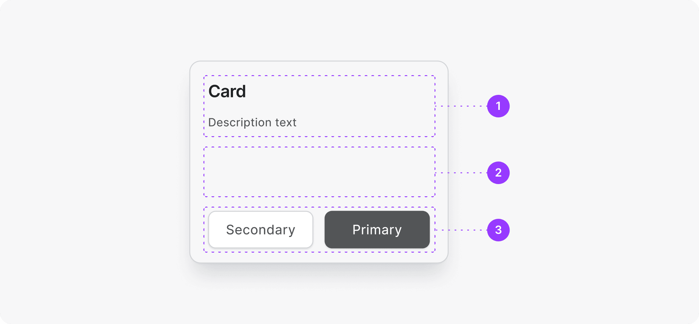
(1) Header (2) Slots (3) Actions
The card’s properties support flexible layouts through slots, size and alignment controls, and toggleable elements like descriptions and actions. These options allow the same component to scale from a simple label to a rich, interactive layout without duplicating or breaking structure.

Slot Logic
The card supports multiple configurable slots, allowing content like checkboxes, text-inputs, or custom elements to be injected without altering the core structure. Each slot is optional and adapts spacing automatically, so designers and developers can mix and match layouts without needing separate variants.
It also mitigated components being detached, which was a HUGE win 🥹.

Documentation
When documenting the system, my goal was to keep it simple and approachable for everyone and not just designers. For more complex topics like variables or semantic aliasing, I added short overviews so teammates could understand the logic without getting lost in the weeds. Not every component came with full documentation, mostly due to time constraints, team size, and how closely we collaborated day to day. The focus was on clarity, not perfection.

Results
“Design systems aren't a project. They're a product that needs ongoing investment.”
— Brad Frost, Atomic Design
Canopy made the design-to-dev workflow faster, clearer, and far less painful. Once foundational tokens and components were in place, our team could move from concept to live feature with less back-and-forth and fewer inconsistencies. Developers spent less time guessing spacing, styles, or states because the system handled those decisions up front. Designers prototyped faster, reused components with confidence, and spent more time solving real UX problems instead of rebuilding buttons.
While we didn’t track exact time savings, the difference in day-to-day collaboration was immediate. Fewer Slack questions. Faster QA. More alignment.
© 2026 Matt Girardi.
Thanks for scrolling. All rights reserved.